![FMN_logo_2024.png]](https://support.forgetmenot.chat/hs-fs/hubfs/FMN_logo_2024.png?height=40&name=FMN_logo_2024.png)
✅ Logo overlays should be placed within one of the image thirds (orange lines) and inside the 20 pixel edge boundary (white line) to work best in the Mobile App, Learner Web and Management Console.
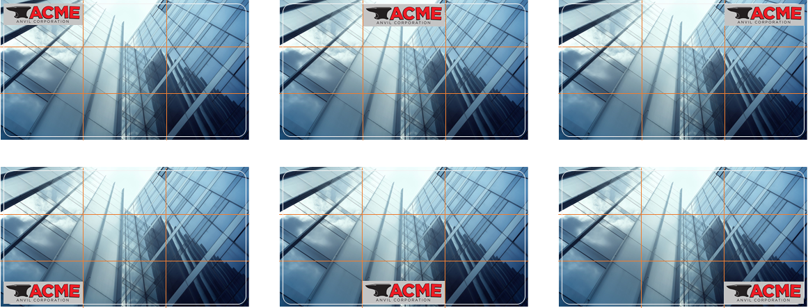
Example of the location of image thirds and edge boundary markings on a 1920 x 1080 image

✅ The top left corner is the recommended logo position where possible
Logo Overlay Rules
- The logo width should not be greater than 1/3 of the display image width
- The logo height should not be greater than 1/3 of the display image height
- The logo should not be stretched or skewed to fit within the zones
- The logo must be resized with aspect ratio maintained to fit with the zones
- Logos must be inside the keep out zone (white frame) and cannot be closer than 20 pixels from any edge
- The position of the logo should not cover the main purpose of the image, choose another position to suit or flip the image as required
- Select / crop the image as required so the logo isn’t impeding or looks awkward or distracting on the image
- Logos can be transparent if required however a solid color backgrounds as recommended
- Logos are not mandatory on display images
- Where multiple logos are required ensure the layout and position is balanced and does not impede any part of the main image
Logo Overlay Position Examples
✅ The logo ratio should be maintained without exceeding the image thirds area size (see examples)