The enrolment insights graph represents learner engagement at a particular point in time along the enrolment status timeline. There are some key stages for enrolments that can indicate if the learner engagement is good 😀 or not as good 😔 as it could be.
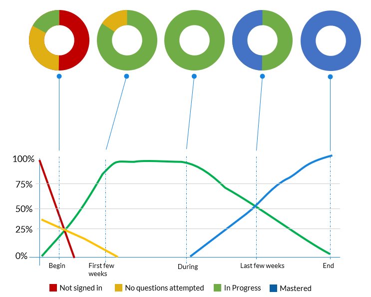
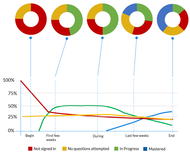
- Beginning - this is when new learners are onboarding and some people might need help
- A few weeks in - this is when 80 - 90% of learners should be active and in progress
- During - the ideal is to have 100% of learners active and in progress
- Last few weeks - increasing number of learner should be mastering the series
- End - the ideal is to have 100% of learners master the series before it ends
What does Good Learner Engagement look like
The following graph shows a typical flow of status with good learner engagement. At key points a representation of how the status donut might look like is shown for comparison.
What does Poor Learner Engagement look like
The following graph shows a typical flow of status with poor learner engagement. At key points, a representation of how the status donut might look like is shown for comparison.
✅ Why not understand what all of the enrolment status values and colours mean